Showing posts with label blue. Show all posts

blue monday - what does it mean to you?


Apparently today is blue monday.

Have you heard about this?

When I heard "blue monday" images of azure, cobalt and sapphire flashed through my mind,
it sounded gorgeous!

However, that's not what they meant.
It's supposed to be the most depressing day of the year.

 I like my version better.


cheers!


Hello friends!

It's another Monday, and another fabulous Crushing on Color post!

Todays treat for the eyes is brought to us by the ever-inspiring Carol,

If you haven't been over to Carol's blog, you're missing out on an absolute goldmine of DIY ideas.
She not only posts the finished products, 
but there's always step-by-step instructions for those of us who may not be as crafty as she :)

Let's see what color Carol is crushing on these days, shall we??


The Design Pages


Hello to all the 10 Rooms lovely readers.

I'm Carol from The Design Pages.

It took me only a split second to decide after being asked by Anne-Marie to be part of the
Crushing on Color series.

Peacock blue has become a favourite for me in both fashion and design.

This is my favourite shade for furniture or walls.


My favourite shade is one that is right in the middle
 of the light, almost turquoise, and the deep royal blue.

This shade can look fresh and hip.


It can also look calm and sophisticated.


It works paired with other bright, bold colours.


It also looks amazing with neutrals.
A little pop can go a long way with this very versatile colour.


If subtlety is not your style,
you could go all out with this wallpaper.


My very favourite of all the combos is the peacock blue and yellow mix.


There is definitely a peacock blue room in my future...

 but for now I'll settle for a bit of this...


1 2 3 4 5 6 


So, what do you think?

Do you love peacock blue or is it a bit too much of an attention hog for your liking?


Thank you, Anne-Marie, for having me over today.

Carol


Carol, your post is gorgeous!

Such a rich, lush color, yet it's so versatile... we're completely on the same wavelength, hon.

(when Carol sent over this post I had just taken my daughter fall shopping
 and bought her THREE peacock blue tops and matching nailpolish!)

And the peacock and lemon mix?  LOVE!

Thanks so much for taking the time to guest post... and as always, 
I'm looking forward to swinging by your place and
 seeing what shenanigans you've got going on - x

Anne-Marie


Crushing On Color: Sarah from Flourish

It's Crushing on Color time, ladies - yay!


I promised you a fabulous post from a fabulous blogger and here it is - 
Sarah from Flourish Design + Style
has graciously agreed to share her current color inspiration with us....


flourish design + style


It's been some time since being asked "what's your favorite color? " 
The first that came to mind was white. 
Creamy white and true white and any shade in between. 
Crisp cottons and wrinkled linens. But maybe that's just because I'm thinking summer. 
What about a creamy white with a pale grey undertone? 
Now I'm thinking about interior walls and woven blankets. 
Top it off with some injections of crisp blue, and there it is! 
My color crush! 

What I'm loving right now...blue.

The awe inducing Smythe blazers bring a fashionable edge to the simplest of outfits-


I think of bright royals, worn chambray and crisp denim. 
My go to shorts this summer are a short, cuffed tailored pair of soft denim that tie with a bow. 
There's nothing that doesn't look great with these shorts.


These images from Style at Home show a lovely blue,
and just how to mix it in to a neutral interior. 
It appears traditional with some spunk, tailored and crisp. 
It evokes a feeling ( for me ) of clean, crisp and fresh.

So thanks Anne-Marie for asking the age old question, 
the answer to which changed almost daily as a child, 
and to which I can answer now as blue.

Sarah, x


Thanks so much, Sarah!

I thought we may have a white post there for a moment!

Blue in all it's glory will always be near and dear to my heart -
it's such a versatile hue - 
ranging from energetic (cobalt)
to stately (navy)
to perfectly restful (pale tints)
and more...
how could anyone resist it in some form or another?

Be sure to pop over to the ever-charming Sarah's blog,
it's filled with gorgeous inspiration daily,
always very tasteful and ultra-chic,
and sometimes you get a glimpse of her gorgeous home
(which I"d love to see more of - hint hint!!)


Feeling very ambitious this morning, lol...
hoping to finish restoring the desk today, in between consultations...
it's our fourth date - next time I post about refinishing something antique 
please just tell me to give it a gorgeous coat of paint and let it be :)

xx


Crushing on Color: Abby from A Delightful Design


Todays fabulous Crushing on Color post is from


Hi friends!  It's Abby from A Delightful Design.  
I'm a huge fan of Anne-Marie and so excited to be here!

Beyond any other color, I am the most drawn to blue.


Patricia Larson via Elle Decor


It could be because I grew up with Lake Huron as my back yard.
  
I truly believe that what you're surrounded with
 as a child has an effect you--
even color.


Blue looks amazing with every color.  It can calm and it can energize.


odi et amo


I have yet to meet a blue wallpaper I didn't love.


san marco wallpaper


More blue prettiness.  
Although I can't decide if it's the blue and pink combination
or the light fixture I'm drawn to.  
Both!


Civilty Designs


Four years ago I painted our living room Boca Raton Blue by Benjamine Moore.

 It was a crazy time in our life.

 Afterwards, someone mentioned that blue is the color of the throat chakra
 I know nothing about chakras but found it interesting that this color
all relates to how we express ourselves with our voice.


Even years later this is my favorite room.

Doesn't it look fabulous with orange?!


Tobi Fairley


My next step? 
 Going glossy with blue.  
We are moving in the next couple months and I'm dying to try this.


I hope you enjoyed these little pieces of me and my passion for blue!

Abby


Thank you, Abby!

I feel lucky to have found your wonderful blog - you are a talented designer with fabulous taste..
but more than that I feel lucky to count you as a friend.

Your home really reflects your attitudes,
it's classic, but never stuffy,
polished but not overdone.

I love your living room, and can't wait to see the glossy new version 
in your soon-to-be-found-perfect-home :)

Head over to A Delightful Design to follow Abby's adventures in decorating...


Thursday's post is another bit of pretty in the Crushing on Color series-
and you will love the spectacular images...gorgeous!

x am


Crushing On Color: Brittany from Gallery No 8


The second post in the Crushing on Color series
is brought to you by 
Brittany of Gallery No. Eight.


Morning everyone! 
 and I'm so excited to be sharing my favourite colour with you today! 


Anne-Marie is one of the loveliest people I have met since I started blogging
 and I was thrilled when she asked me to guest post on her blog! 
Her posts are always so bright and colourful and lovely :)

I probably never would have picked navy blue as my favourite colour
 a few months ago, but since I've started blogging,
 I've noticed that it just keeps popping up in my posts! 

When I find a room or home that I just absolutely adore, 
it almost always has some blue in it.

My favourite 'blue home' is
Fiona Douglas' of Bluebellgray. 


I love the colours she used on her walls 
(Farrow & Ball  "Pitch Blue" & "Dix Blue"),
 and all the beautiful accents that have some blue in them :)

Some of my other favourite blue rooms include these two:


I love the look of crisp white trim and furniture against the deep blue walls!

I also love little navy accents in a space:


source


I've picked some of my favourite navy pieces from Etsy, 
just in case you want to add a little blue to your home too :)


1 2 3


Hope you enjoyed my little tour of blue :) 


Can't wait to see what everyone else has come up with!!

Thanks so much for having me Anne-Marie!
Hope you all have a lovely day :)

xo,
B


Brittany, great post - thank you!
Your viewpoint is always entertaining and genuine,
which makes for such a good read.


Navy is one of my all-time favourites, as well -
I like it dark and sultry, bordering on black.
 And the art from JKL Design on Etsy?
She is fabulous!
Have to get one of her pieces into my space.


Stop by on Saturday for the next guest blogger
Crushing on Color post...
it's a rainbow of inspiration!


x am


Slinky Inky Blue Walls..The Quiet Room

Finally, we are in the last stages of the living room..
not that any room is ever really finished, is it?
Finished is an awfully strong word. One that leaves me feeling rather penned in.
Lets say we won't be needing anything changed for a while..
except for a wee bit of lighting!

This room was meant as a dining room, and we tried using it as such,
 but our two chocolate brown labs love to sneak up on the sofa, which means it's better off in this space.
Also, now our dining room is right off the eating area for the kitchen, 
which means the kids can have their own dinner party on weekends when we have friends in,
 while we get to visit in relative peace (and still see them flinging peas at their siblings :)

This chandelier is from the previous owners - don't hold it against me!
I have tried to unsuccessfully give it away to several people who need one, to no avail -
not that I'm really surprised..
Haven't found exactly the right light to replace it yet, but I'll show you when I do.

Here's the view from the front hall.


I have always scoffed at people who had formal living rooms, thinking they were wasted, roped-off spaces that simply gathered dust and admired themselves.
Now I have one! Almost twelve years of child-proofing has led me to want a grown up room.
ONE ROOM where it's always clean, and devoid of toys :)

A quiet place to read.


After we reclaimed this space as "adult", a funny thing happened - 
I started finding the kids in here. A lot.
There's no tv, radio, etc.
So what were they doing in here?

Reading, just like I was.


Perhaps there is something to that overstimulation theory :)
The darlings were craving peace and quiet just as much as we were.


The palette came from my vintage leather chairs, my favourite glamour girls, 
which were my first real furniture purchase so many years ago.. 
I considered changing them out for something more practical this spring, but couldn't :)
I bought these when I was still sleeping on a futon.. priorities!


The wall colour is Ralph Lauren's Urban Loft, a deep, inky navy that verges on black.
This room has western exposure, and I snapped these pics in the afternoon,
 so this is the brightest it gets - I love it! 
Don't be afraid to use dark / saturated hues in small spaces.. it enhances the ambiance.
Light tones often accentuate shadows, and highlight the dimensions of the room,
making it actually feel smaller.


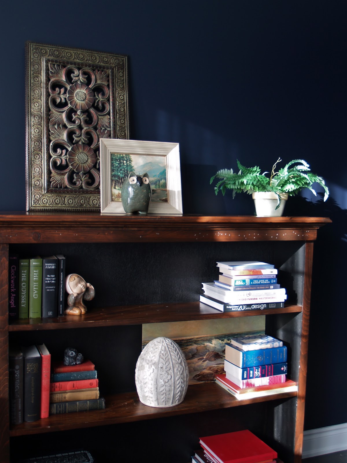
You may recognize the bookshelf, I bought it at a garage sale this spring, 
it was previously in our bedroom
and I'd just like to say -  D, you are a prince for moving furniture all over the house, again and again :)
This room had been lacking a focal point. 
Since we aren't putting in a fireplace anytime soon, the bookshelf takes the place of the mantle,
 and provides storage for the heaps of books that are always finding their way in here.

A thrift store landscape and dollar store owl (he followed me home, really) 
live here with a carved wooden screen from a hazy vacation long ago..


Although I prefer quirky art, D. prefers the realism of naturalist Robert Bateman and the like.
This black bear print was an early investment piece for us, a compromise..
I surrounded it with some art cards I have been toting around for quite some time.
I'm sure you recognize these famous Japanese works.
Mounted on hand painted japanese paper, they have found a perfect home.


On the other wall is a couple of old frames from the Sally Ann, painted black and filled with some DIY fern art, more pics at the end of the post on that.
Another print, this one by Paul F Gauthier, who painted alongside the Group of Seven. 
Although his work did not achieve the same noteriety as theirs, I am drawn to it.
My father found this print for me, and so it will always have a special place in our home.


My charming little owl..


Paisley is my favourite motif, it runs through the house, popping up here and there..


Cameron and I have begun playing chess together regularly..
he is eight and I have to really watch him!
A natural strategist.. grinning as he claims my pieces, one by one.


There you have it, guys.. if there is still anyone reading after all that hope you enjoyed!

The fern art you saw is probably a placeholder until we find some other things,
 it was made really simply.
I wanted a botanical influence here, a hit of green with navy always works,
but something unique, a different way of presenting ferns.


I pressed some fern leaves between paper towels and left them under a stack of books to dry.
 Repainted the empty frames black, then rubbed to allow a little of the gold to show through.
Then I cut two pieces of foam board to fit the empty frames,
covered them with some navy linen (leftover from my curtains) which was secured on the back.
I coated them in spray adhesive, gently laid the frens on top, and let dry.
 A generous coat of Modge-Podge sealed the ferns.
I popped them into the frames and voila, art under $10!
I think I may trim them with some black velvet ribbon, just to add a layer,
 but I love the texture they add.


This room has some new, and some old, but it's all the things we love..
and in creating a quiet space for ourselves we spend more time being quiet, together.
It's funny how homes evolve to suit the needs of their occupants..
 sometimes needs you didn't even know you had :)

til next time..


Room Design Pictures Proudly Powered by Blogger