Showing posts with label colour consultation. Show all posts

how to incorporate bright pink paint into a girl's room


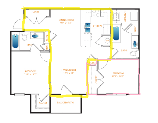
So a little while back I had a client email me for an online consult. He had just moved into a new condo in the city with his daughter. We worked on choosing two grey paint colours for his main space, and then he asked for help with his little girls room, shown bottom right in the floorplan below.


It seems like most young girls request a pink room at some point, and it's almost always fuchsia, or another shocking shade of this colour that they like. The question is how do you work this colour into their rooms without it becoming garish?

My client asked me to find a way to tone down the colour, and work in black, which is what his daughter had asked for. This is not a large space, and so we needed to incorperate the pink without it overwhelming the space. Thought maybe some of you are struggling with the same dilemma in your own homes, and would be interested in the options we discussed.

First of all, I asked him to show his daughter the photo below - was it really bright pink she wanted, or just pink? A softer pink could be paired with black and used on all her wall space and the effect would be soft and lighthearted.


Nope. MUST be bright pink.
How about bringing the bright pink through accents?


No dice. ON THE WALLS. Right. This girl knows what she wants! Moving back on track...


First of all, there is the accent wall. I'm not a huge fan of accent walls, but in a child's room, on the headboard wall, they can work. I suggested a white bedding, warm white on the other three walls, and adding the black accents on those walls via picture frames. This striped treatment can be achieved by using a high gloss and flat paint in the same shade.


and while we are on the topic of stripes, this is cute as well....


Second, the partial wall options - these emphasize the horizontal and thus make the room feel larger.


love the black pinstripe detailing on this version....


The next look brings in slightly more pink on the walls but still allows for some visual relief - 
three tints of pink in an ombre horizontal stripe. Darling, isn't it?


But what if we NEED to have pink on all the walls, to bathe ourselves in the very brightest pink out there? Well, you can always cheat a little - bring the ceiling colour down a few feet and have the pink meet it (I did this in my son's room when he insisted on royal blue walls in a space with north facing windows). You'd be amazed what a difference this 20 - 30" makes...


My client and his daughter mulled these over, and in the end she fall in love with the striped headboard accent wall idea. I suggested Benjamin Moore Peony 2079-30 on the headboard wall in a semi-gloss and matte to create the striped effect.


If you are working with white furniture, like my clients, you want to ensure that the walls are a warm white, because white furniture is seldom a true white. If the white on the walls is too cool then the furniture will look dingy. Benjamin Moore Simply White OC-117 is soft and warm with out being too yellow, and works well with Peony on the three remaining walls. 


I suggested black be used sparingly, on picture frames, desk accessories and a pillow or two.
This keep contrast to a minimum and doesn't create a lot of visual distraction.

I'm happy to say that both my client and his daughter love her finished room, so my job is done!


Have you ever used an option like these to tone down the impact of a vibrant colour in your home?
Which one would you choose?


Feng Shui in a Family Room

So this fall a really interesting client emailed requesting an online consult. K and her family have just recently moved into a new house, and are working toward creating a harmonious home incorporating Feng Shui.

I was at once intrigued. I have a very loose knowledge of the Feng Shui principles, having applied certain bits to my own home. Even if you do not specifically subscribe to the belief that our homes have energy passing through them, and we can funnel that energy in ways that are beneficial to us, I think that anyone who is consciously working to create harmony and order in their home to better their life is probably applying this same effort in other areas of their life, and this will likely bring them some great results. There are also some facets of Feng Shui that simply reflect good design principles, such as incorporating mirrors to bounce light (or energy :) around, eliminating clutter and restricting your colour palette. There is also the familiarity factor: it may bring a certain sense of peace to a person knowing that specific areas of your home are always going to contain certain colours, for example.

The first room K wanted to work on was her family room. A traditional modern family two-story, the family room is open to the kitchen/eating area.

Here are some of the before shots:


Beautiful wood floors that complement the cabinetry tones, a lovely fireplace with built-ins, a breakfast nook and plenty of natural light and space - this home has great bones to work with!


K wanted to work with blues or greys, to bring the best fang shui for the particular positioning and placement in the home found here. I agreed that cool-toned walls would work, as her space receives warm southern light and has all that lovely warm wood for balance. Blue pairs effortlessly with orange-toned woods because they are complements on the colour wheel, and blue brings out the richness of the wood. K has bold colours present throughout her home, and wanted this space to have some character.

After working out that K quite liked modern furnishings, we needed to find a way to mesh those styles with her home, which is much more traditional. She had already ordered a white leather sofa. The first thing to work on was the floor plan. By placing the sofa against the wall we opened up the room, creating a better flow (for Feng Shui and design purposes!) I suggested K purchase two chairs to face the sofa, thereby adding comfortable seating without blocking the doorway off. A low bench positioned where the sofa had previously sat provides additional seating for larger gatherings but still allows the two areas to be connected.


Since we are planning to move onto the living and dining areas next, I suggested adding a warm orange in small accents to give us another colour to pull out in the adjoining rooms. The wall colour you see here is Benjamin Moore 1626, Gentle Gray.

DESIGN TIP: When working with pale blues, you really want a grey with a blue undertone, rather than a true pale blue, or your room will look like a baby boys nursery :)


Chunky chairs in the same espresso finish as K's table and chairs help the two spaces to relate to one another, and of course we need a round coffee table - this is a major Feng shui principle - avoid corners whenever possible, they are thought to create disruptive energy within your home. a selection of carpets allows K to choose exactly how energetic she would like this space to feel, and of corse, the art references the Feng Shui water element we are channeling here.


K responded that she wanted to replace her dining set with something lighter and more modern, and that she was wary of making such large commitment to blue with the leather chairs. She sent a link to the dining set she was considering, and asked me to create a board incorporating that and the large floral carpet. These chairs work with the wood tones present, and the modern abstract back picks up on the legs of her new dining chairs. Having just the seat upholstered blue allows for that hit of colour without the commitment - it would be easy to swap out this fabric down the road.


After receiving that board, K mentioned wanting a more neutral option to show here husband, who wasn't sure about the blue. She had used Benjamin Moore OC-52 Gray Owl in another room in her home which faced north, and had thought it was a bit too cold for the family room. I assured her that in the warm southern light at the back of her home Gray Owl would appear more neutral, and suggested she try a swatch out. 


I sent her another board illustrating this neutral palette option. I'm in love with that carpet. LOVE.


At this point we were nearing the beginning of holiday season. K wrote that she loved both options, but that she was leaning toward the more neutral version. After New Year's I got an email that made me smile :) K and her husband tried the Grey Owl on the wall, and found it did nothing for them, but the bluer option, Gentle Gray, looked wonderful! They decided to go ahead with the second blue design option, and were very happy with the progress so far. I'm hoping for some pics of the finished space to share with you...

and that, darlings, was my first official Feng Shui Design Consultation! Something of an adventure, and I learned a lot along the way... as side note, I may try to tackle how to bring some basic Feng Shui principles into your home in some future posts - would you ladies like to explore with me? I'm thinking a little cleaning a re-organizing can't hurt anyone.... my house could definitely use some love! x


Retro Mix First Home


A few months back E. emailed me asking for a design consultation for her first home. Being a military family, this couple has moved and travelled extensively, but after receiving a long-term posting had just bought their first home. I LOVE working on a first home with a client - they are always so enthusiastic and appreciative of their space. E described her loves as mid-century style, and the colour red.

Sounded intriguing!

When E. sent me the photos of her home, they brought back a flood of memories - their home is a raised bungalow, and the layout actually almost identical to the first home my husband and I bought, almost fifteen years ago. The open living space is lovely, and E. already had some great mid-century furniture and unique accessories from living abroad that she wanted to incorperate. The challenge was to make it all work together.


E. decided to replace the vintage orange chairs with Ikea Poang chairs, and the existing sofa and console were to remain. She wanted to work on tables, lighting and accessories for the living room. In the dining room, the table and chairs were staying, so we needed to find a way to make the dark finish work with the rest of the space. E. wanted to update here kitchen by painting the cabinetry and adding a new countertop and backsplash.


We started with the living room space. Here is an inspiration room that best summed up the feel we wanted to achieve.


The caramel tones in E's sofa and console really set the palette. She and her husband plan to replace the beige carpeting in the living room with hardwood down the road, and so we decided to lay an area rug down over the carpeting now that will work over the hardwood once it is in place. Since E and her husband both like bold, saturated colour, we incorporated red and small amounts of green as accent colours, against a clean backdrop of walls painted in Benjamin Moore's Moonlight White.


E has a handy husband, lucky girl, and he reconfigured the small cabinets that go with the console into side tables by mounting them horizontally onto some vintage legs he found. The console will serve as an entertainment stand, with the television placed on top. The only things we were really missing were lighting, a carpet and a coffee table. I found the vintage inspired surfboard table on Etsy - E had it custom made in a glossy red. A moroccan inspired carpet adds some softness to the design, and the diagonal pattern will lead the eye across the entire space, corner to corner, visually expanding the living room.


As always, there is a plant tucked in here. This is a fiddle leaf fig, the tree to end all trees :)
It's large size will fill in the space beside the console, and if it were real it would bask in the light from the large window. The couples frequent travels don't allow for plants, so this very good quality imitation will work for them.

If you know me at all, you know I'm an art junkie! 
The sofa needed tone grounded into that large blank wall, and defined as the focal point here.
Since we are on a tight budget, I suggested E purchase a canvas and try an art DIY...


In the end, however, she decided to add some bold red wall cubes above the sofa and place some of her treasures collected through the couples travels - 
perfect for remembering all the previous homes they have lived in.


Let's look at the changes the kitchen are currently undergoing.
The cabinets are in good condition and so will be painted out white to freshen up the space.
I suggested adding a butcher block countertop in beech from Ikea to bring some of the wood tones from the living room into this space, and keep it warm -
don't you love the way they have stepped the end of the breakfast bar, below?
Hardware with a retro feel in brushed stainless will work perfectly.


E wanted to add a backsplash. 
A subway tile is a classic look, but we wanted something a little edgier. 
How about a square tile, with dark grey grout.
This echoes the retro vibe we've got going on, 
and adds some graphic lines here without overwhelming the space.


Since the back wall of the kitchen is the first thing you see when entering from the living room, 
we needed to add some interest to this spot. 
I suggested E remove the wall cabinet between her sliding door and kitchen window, 
and add open shelving.
After considering various options for the shelving,
 she decided to use the leftover Ikea countertop and install wood shelving here, 
creating a beautiful place to display a collection of colourful ceramics, etc.


Although E will be keeping her dining set for now, a change is not far down the road.
A table in the same wood tones as the countertop and some interesting red chairs will keep this space light-hearted and consistent with the rest of the home.


and, of course - art again!
LOVE these Enzo Mari prints for the dining room wall.


E has been wonderful about keeping me up-to-date on her progress, and the work here is nearly complete. She is loving the way the changes to here home have brightened the space up, and unified her furnishings and all the treasures from the couple's travels.

Hopefully I'll have some pictures of the completed space to share with you all soon!


Room Design Pictures Proudly Powered by Blogger