Showing posts with label white spaces. Show all posts

Retro Mix First Home


A few months back E. emailed me asking for a design consultation for her first home. Being a military family, this couple has moved and travelled extensively, but after receiving a long-term posting had just bought their first home. I LOVE working on a first home with a client - they are always so enthusiastic and appreciative of their space. E described her loves as mid-century style, and the colour red.

Sounded intriguing!

When E. sent me the photos of her home, they brought back a flood of memories - their home is a raised bungalow, and the layout actually almost identical to the first home my husband and I bought, almost fifteen years ago. The open living space is lovely, and E. already had some great mid-century furniture and unique accessories from living abroad that she wanted to incorperate. The challenge was to make it all work together.


E. decided to replace the vintage orange chairs with Ikea Poang chairs, and the existing sofa and console were to remain. She wanted to work on tables, lighting and accessories for the living room. In the dining room, the table and chairs were staying, so we needed to find a way to make the dark finish work with the rest of the space. E. wanted to update here kitchen by painting the cabinetry and adding a new countertop and backsplash.


We started with the living room space. Here is an inspiration room that best summed up the feel we wanted to achieve.


The caramel tones in E's sofa and console really set the palette. She and her husband plan to replace the beige carpeting in the living room with hardwood down the road, and so we decided to lay an area rug down over the carpeting now that will work over the hardwood once it is in place. Since E and her husband both like bold, saturated colour, we incorporated red and small amounts of green as accent colours, against a clean backdrop of walls painted in Benjamin Moore's Moonlight White.


E has a handy husband, lucky girl, and he reconfigured the small cabinets that go with the console into side tables by mounting them horizontally onto some vintage legs he found. The console will serve as an entertainment stand, with the television placed on top. The only things we were really missing were lighting, a carpet and a coffee table. I found the vintage inspired surfboard table on Etsy - E had it custom made in a glossy red. A moroccan inspired carpet adds some softness to the design, and the diagonal pattern will lead the eye across the entire space, corner to corner, visually expanding the living room.


As always, there is a plant tucked in here. This is a fiddle leaf fig, the tree to end all trees :)
It's large size will fill in the space beside the console, and if it were real it would bask in the light from the large window. The couples frequent travels don't allow for plants, so this very good quality imitation will work for them.

If you know me at all, you know I'm an art junkie! 
The sofa needed tone grounded into that large blank wall, and defined as the focal point here.
Since we are on a tight budget, I suggested E purchase a canvas and try an art DIY...


In the end, however, she decided to add some bold red wall cubes above the sofa and place some of her treasures collected through the couples travels - 
perfect for remembering all the previous homes they have lived in.


Let's look at the changes the kitchen are currently undergoing.
The cabinets are in good condition and so will be painted out white to freshen up the space.
I suggested adding a butcher block countertop in beech from Ikea to bring some of the wood tones from the living room into this space, and keep it warm -
don't you love the way they have stepped the end of the breakfast bar, below?
Hardware with a retro feel in brushed stainless will work perfectly.


E wanted to add a backsplash. 
A subway tile is a classic look, but we wanted something a little edgier. 
How about a square tile, with dark grey grout.
This echoes the retro vibe we've got going on, 
and adds some graphic lines here without overwhelming the space.


Since the back wall of the kitchen is the first thing you see when entering from the living room, 
we needed to add some interest to this spot. 
I suggested E remove the wall cabinet between her sliding door and kitchen window, 
and add open shelving.
After considering various options for the shelving,
 she decided to use the leftover Ikea countertop and install wood shelving here, 
creating a beautiful place to display a collection of colourful ceramics, etc.


Although E will be keeping her dining set for now, a change is not far down the road.
A table in the same wood tones as the countertop and some interesting red chairs will keep this space light-hearted and consistent with the rest of the home.


and, of course - art again!
LOVE these Enzo Mari prints for the dining room wall.


E has been wonderful about keeping me up-to-date on her progress, and the work here is nearly complete. She is loving the way the changes to here home have brightened the space up, and unified her furnishings and all the treasures from the couple's travels.

Hopefully I'll have some pictures of the completed space to share with you all soon!


yay or nay: a different kind of kitchen


While I'll always be a sucker for white cabinetry and carrera marble... there seems to be a growing movement toward kitchens with a touch of tattered soul. I'm seeing more and more wood countertops (scratches be damned!), unfitted cabinetry and retro-styled appliances.


This one in particular captures the look I am talking about - almost feels like an old deli, doesn't it?


Loving the hits of copper, vintage fridge and scale, and all that gorgeous rich wood - although balancing my dish ware atop crates may be taking "unfitted" a bit too far :) Now, what do you suppose that saw is for?!!


a spectacular kitchen floor + ceiling, and some fantastic art lighting


Happy monday!

How was your weekend?

I was bit under the weather this weekend, so not much got accomplished around here - 
did manage to squeeze in a wee bit of time for pinterest, somehow - 
funny how that happens, lol...


When I saw this kitchen pinned over the weekend my jaw dropped.

Barrel-vaulted brick ceiling.
Exquisite painted timber floor.
Open shelving + lattice cabinetry.
Art + a few hits of playful colour.


Spaces like this make me want to ditch this place and move into a century home stat.

A little digging, and found the rest of this home via apartment therapy and kikette interiors.


It has a very consistent look.
The white walls continue throughout, as do those floors.
The decor is clean neutrals, again with the pops of colour place sparingly.


There was one detail that I absolutely loved.

Look at the way they've lit their artwork.
Wall-mounted reading/work lights that not only light up these pieces in the evenings, 
but also to frame the art and draw the eye in the daylight.
They become part of the composition.

I've never been a huge fan of those unappealing mini lights tucked in over the top of the frame -
they aspire to be invisible but just end up a visual distraction -
but these are a different story, yes?


If you're interested, here are a few versions from... 


must be off, busy, busy day today...
hope you all have a lovely monday....x


Simplicity loves Energetic Color

Right now I am completely obsessed
 with neutral spaces that use saturated color in clever and uncommon ways,
and if this home by Kay Douglas doesn't qualify, I don't know what does.

Revelling in the contrast of fabrics, finishes and accessories chosen with such restraint-
and then bursts of joyful color, splashed about with abandon.


(Thank you, Verdigris Vie, for sharing this one - I don't usually pick up a copy of Veranda,
but perhaps it's time to start!) 


Amazing how the lack of pattern and accessories can balance out the intense energy of these hues, isn't it?


Makes me want to put away half the bits and bobs around my own place!


Hope you all had a happy thanksgiving here in the north -
we survived two days of hosting huge dinners, 
(23 lbs of raast beef, two turkeys, two spiral hams, potatoes, yams, brussel sprouts,...  you get the idea!!)
and had such a fantastic weekend visiting with our families.

Topped it all off with a fall boat ride yesterday, 
touring our muskoka coastlines and admiring the gorgeous fall colors.


It left me glowing, truly, and very grateful for all that we are blessed with.
Weekends like that are what it's all about....xo


Miss N's room: the reveal


If you read monday's post,
you know we've just finished Miss N's room.


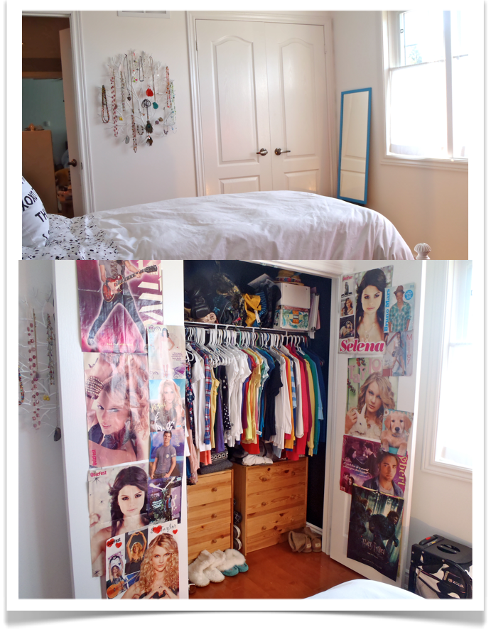
This what we started with....


you can read more about that here.

It all began with a brilliant azure box Natasha found while we were out shopping one day.
She decided on a blue and white scheme.
Since she has a very dark grey leather chair, and LARGE tv in there, I suggested hits of black as well.

Done.

We (that means I, lol) painted the black walls white -
used Behr paint plus primer in Falling Snow, for the first coat.
It covered incredibly well, but the color was far too warm for a west facing room,
and the range of whites is really limited with this brand (are you listening, Behr?!!).
So, we layered 2 coats of Martha's pure white 
(no tint, straight out of the can - how's that for easy?!!) on top.
That's it, three coats, not too painful after all...


If you are looking for brilliant white walls, this is your paint -
the result was a very bright, slightly clinical space.
We color matched the box into a behr ultra base, as well.
(it's close to Brilliant Sea 520B-6)

This would do for the old cork board we planned to rescue from storage,
the existing mirror she used over her dresser, and a new long wall mirror.


We painted out a wire branch sculpture for an art/jewellry display....


Now, the palette was dynamic, 
but it needed warmth, and no ordinary canary or watermelon would do -
 so enter the fluorescents!

Yup, fluorescents.

Tash's idea :)

She's only this age once, why not let her have a little fun?

We upgraded a vintage dress form, and painted out some frames and canvasses
(I'll post more about the DIY art process tomorrow - SUPER easy)


Would you like to see how it all came together?


the view from the door...


Miss N headquarters - which is NEVER this tidy :)
We added a little zebra to the newly painted bulletin board -
looks like it's painted on, but it's actually a really heavy wrapping paper, shh, don't tell...


Ikea frames - 3 for $5.
With this price point and arrangement,
she can add to this wall whenever she likes.


Rocks and crystals.
It's a fascination, and she finds them EVERYWHERE :)
We corralled the largest and prettiest into lucite trays for display.


The bed.
Dressed with a new duvet and pillows (perfect for a constant "texter").
Framed out with our DIY art and a funny little printout that has sentimental value.


Are you wondering where all the teen "stuff" is?

Well, the dresser holds heaps of bits and bobs...
but what about the umpteen posters?

One is waiting to be hung behind the door...


and the rest live here....


Let's just keep those closed, shall we?!

That's it, the big reveal...

hope you like it, 
Miss N is over the moon, and that will do for me - x


inspired by retail design...

Sometimes I think I have a problem.

Do you ever go shopping and spend more time looking at the store display's and fixtures than the products?

One of my favourite spots to shop is Aritzia.

For those of you south of the border, you may not shop there - yet.
But I bet you will!!

Aritzia is a Canadian-based clothing store
 that mainly stocks in-house labels like A Moveable Feast, TNA and Wilfred.
 But they also cater to the high end-denim market, 
and extras include hipster essentials like Sorels, Toms shoes, 
TNA iPhone covers, Dylan's Candy Bar buckets, etc..

Whatever is of the moment.


Their aesthetic is clean and organic, yet urban.

Packaging and labels are based around specific artists each month,
and DJ's create their playlists (sometimes playing in-store),
which are available for listening on the blog.
Quite often one of these is going in the 10 Rooms "headquarters", lol.

It's polished, luxury, street style.

Their new Wilfred store in TO is no exception.

I was there recently, but my pics aren't quite a snazzy as the ones provided on the blog..


I'll take some of those windows, and the pendant, thank you.
Thinking it's a painted Restoration Hardware Polyhedron, right?


Warm white walls, filled with gorgeous mouldings,
 the raw wood floors, and graphic black metal make for a perfect backdrop.

Here it allows the product to be the star, 
but in a home this would frame out a furniture and art collection to perfection.


Loving the peacock tufted leather, overdyed orientals, art display, and panelled dressing rooms.


The cash counter, with it's inlaid marble top, before the madness.. and after!


If you know who the talent behind this is, please share.

And please, puh-lease, tell me you are out shopping and takings pics of store fixtures as well!!


.

Pinstriping in the Kitchen


it's all in the details...


I love how pinstriped walls and black uppers pick up on the stove detail in these kitchens.


(I expect we'll be hearing more about him shortly -
 he's the chosen designer of the Kardashians :)


Crushing On Color: Jules from The Diversion Project


The Crushing on Color series is where we get a little glimpse 
of what colors make our favourite bloggers hearts aflutter...

today I am super-excitied to bring you Jules,
from the seriously cool blog The Diversion Project.

If by some rare chance you have missed the spectacular collection of homes she profiles on her blog..
you need to set aside a chunk of your afternoon, break out some bevvies, and prepare to swoon.


Hi, I'm Jules from The Diversion Project

When Anne-Marie asked me if I'd like to take part in her Crushing On Colour series, 
I kind of thought for a split second 
"is this a trick question?" 
I mean first of all who wouldn't jump up and down with a welcome back Kotter hand in the air
 to be part of this fabulous fun and then second of all I had to stop
 and ask myself, 
"do I actually do colour?!"

But reading further down the sweet email I snorted when I read
 Anne-Marie's words "And, yep, black and white and wood and concrete count as colors :)".

She knows me too well!


 via


So I thought, cool, black white wood and concrete, I can do that kind of colour! 
But then I thought there must be more to my colour radar than that. 
So looking back through the inventory of things that grab my eye I noticed quite a bit of turquoise,
 a very healthy sampling of grey (yep, I concede, on the cusp of black and concrete again),
 but then suddenly - gold. 

My love of shiny things and refined glamour shone through.


And in so many ways, 
from blind-your-eyes-mirage-in-the-desert to 
burnished umbered mellow patinas in a Milanese kitchen.


Whether it be metallic gold or golden tones, I love the way it can transform a room. 
The soft shimmer often transfixes me when I spot it in a room, no matter what form it comes in.  
But of course golden velvet just might have to be my most favourite form of all.


Thanks so much Anne-Marie for having me over for a little show and tell, 
and for letting me believe that "black white wood and concrete" is an actual colour!

Although, we may need to blend that out a little to "black white wood concrete AND gold"


- Jules


Thanks Jules!
I loved  that you chose to focus on gold, 
because I always have to mentally fight to separate gold from flourishes and roccoco,
and you've shown it in such a modern way, that it leaves me a bit speechless.

When I need a bit of killer imagery, 
something textural and tactile and sexy,
I always head over to The Diversion Project.

You should go :)


Room Design Pictures Proudly Powered by Blogger